Game UI
A HUD that belongs to the scene: text, panels, bars, buttons, a typed field, images and touch joysticks pinned to the screen. Each element is a component on a scene entity, so it saves and loads with the scene, and the scene runtime draws it over the game.
component: canvas_element
module: awake:scene:canvas
Vulkan
WebGPU
Desktop · Android · iOS · Web
Game UI is scene data. For menus, editors and tools written in Kotlin, use AwakeKt Compose instead.
Add a HUD
Give each element its own entity with a canvas_element component. This HUD has a health bar in
the top-left corner, a score in the top-right corner and a jump button in the bottom-right corner.
Both forms below build the same components.
{
  "version": 1,
  "nodes": [
    {
      "name": "health_bar",
      "components": [
        {
          "component": "canvas_element",
          "kind": "Bar",
          "anchor": "TopLeft",
          "width": 240.0,
          "height": 16.0,
          "value": 0.75,
          "color": "#E5484D",
          "background": "#00000080"
        }
      ]
    },
    {
      "name": "score",
      "components": [
        {
          "component": "canvas_element",
          "kind": "Text",
          "anchor": "TopRight",
          "width": 160.0,
          "text": "Score 0"
        }
      ]
    },
    {
      "name": "jump_button",
      "components": [
        {
          "component": "canvas_element",
          "kind": "Button",
          "anchor": "BottomRight",
          "width": 120.0,
          "height": 56.0,
          "text": "Jump",
          "action": "jump",
          "background": "#2563EB"
        }
      ]
    }
  ]
}
world.scene {
    entity("health_bar") {
        configure(::CanvasElement) {
            kind = CanvasElementKind.Bar
            anchor = CanvasAnchor.TopLeft
            width = 240f
            height = 16f
            value = 0.75f
            color = "#E5484D"
            background = "#00000080"
        }
    }
    entity("score") {
        configure(::CanvasElement) {
            kind = CanvasElementKind.Text
            anchor = CanvasAnchor.TopRight
            width = 160f
            text = "Score 0"
        }
    }
    entity("jump_button") {
        configure(::CanvasElement) {
            kind = CanvasElementKind.Button
            anchor = CanvasAnchor.BottomRight
            width = 120f
            height = 56f
            text = "Jump"
            action = "jump"
            background = "#2563EB"
        }
    }
}
The scene DSL has no dedicated function for canvas elements. configure(::CanvasElement) { … }
attaches one and sets its fields.
There is no Studio tab: AwakeKt Studio has no inspector for canvas_element yet.
React to a button
A game system polls the button. consumePress() returns true once for each tap, then false
until the next tap.
class JumpButtonSystem(private val button: Entity, private val jump: () -> Unit) : System {
    override fun update(world: World, delta: Float) {
        if (world.get<CanvasElement>(button)?.consumePress() == true) jump()
    }
}
For a button the player holds down, read isHeld instead. For a joystick, read stickX and
stickY.
Without code, a blueprint on any node of the scene reacts to the button. Its On Button Pressed node names the button by its node's name, or leaves the name empty to listen to the button on its own node. Set Text and Set Visible change another element, named the same way:
On Button Pressed (name: Play) -> Set Text (name: Title, text: Loading) -> Set Visible (name: Window, visible: false)
The project needs the blueprint capability. A blueprint takes no tap from the button: its action,
or a system polling consumePress(), sees the tap as it would without the blueprint.
Canvas components
A canvas element is saved as a set of focused components on its node, one for each concern, and the ECS holds each as a component of its own, so a system can query "every text" or "every button" directly:
| Component | Live type | What it holds |
|---|---|---|
canvas_rect |
CanvasRect |
Where it sits and how big it is. A node with one is a canvas element. |
canvas_text |
CanvasText |
Its words: text or key and args, font, size, alignment, links. |
canvas_appearance |
CanvasAppearance |
Its colours, style and control skin. |
canvas_layout, canvas_cluster |
CanvasLayout, CanvasCluster |
How it places its children. |
canvas_bind |
CanvasBinding |
Game state it shows without code. |
canvas_follow, canvas_follow_arrow |
CanvasFollow, CanvasFollowArrow |
The node it follows; the arrow of a follower pinned to the edge. |
canvas_input, canvas_tooltip |
CanvasInput, CanvasTooltip |
Pressable, draggable, drop target, move handle, wheel; a hover hint. |
canvas_particles |
CanvasParticles |
Particles emitted from or over the element in canvas dp units. |
| one widget | CanvasButtonWidget, CanvasBarWidget, ... |
canvas_button, canvas_bar, canvas_sweep, canvas_stepper, canvas_joystick, canvas_look_area, canvas_text_field, canvas_view or canvas_image: what the element is, with its own values and settings. |
What the player is doing to an element right now, its taps, hover, drag and drop, focus, stick and
aim, is a CanvasPointerState component, which is never saved. The element's kind follows from
its components: its widget's, else Text when it has a canvas_text, else Panel. The properties
below are the older canvas_element's, which still loads: each becomes the component that holds it,
and a scene saves the components. World.syncCanvasElements() brings an entity's components and its
CanvasElement in step; SceneCanvas calls it every frame.
Migrating from canvas_element
Nothing has to change for a scene or prefab saved before the split: it loads, draws and behaves as it did, and the next save writes it as components. To move code and tools over:
- Files.
SceneDocument.withCanvasComponents()andScenePrefab.withCanvasComponents()rewrite a file in the current form;SceneNode.canvasElementView()reads a node in either form as the single record a tool written forcanvas_elementexpects. A field a kind never used, such as a Panel'stextor a Bar'scamera, has no component to go in and is dropped. - Code that builds prefabs.
canvasPrefab { … }and itstext,panel,bar,buttonand other kind functions are unchanged and now save the component set. A setting the element's kind does not use is reported,sweep does nothing on a Panel, so it is not saved, instead of being saved where it did nothing. - Code that reads elements.
world.get<CanvasElement>(entity)and its properties work as before. To read by role, query the components instead:world.family<CanvasButtonWidget, CanvasPointerState>()for every button and what the player did to it,world.get<CanvasText>(entity)for one element's words. Typed parts expose theirs, such as a bar part'swidgetand a text part'swords. Add, replace or remove a component on the entity, or throughCanvasElement.set;SceneCanvasbrings the two in step each frame, andWorld.syncCanvasElements()does it at once. - Kind. An element's
kindfollows from its components. Setting it on aCanvasElementgives it that kind's widget; on an entity, add the widget component.
Properties
| Property | Type | Default | What it does |
|---|---|---|---|
kind |
Text · Panel · Bar · Button · TextField · Joystick · Image · View · LookArea |
Text |
What the element draws. A LookArea is a region where a swipe looks and a pinch zooms. |
anchor |
TopLeft · TopCenter · TopRight · CenterLeft · Center · CenterRight · BottomLeft · BottomCenter · BottomRight |
TopLeft |
The screen point the element is pinned to. |
offsetX |
number (dp) | 16 |
Moves the element inward from its anchor. From a right anchor it moves left. On a centred axis it moves right of centre, or left when negative. |
offsetY |
number (dp) | 16 |
Moves the element inward from its anchor. From a bottom anchor it moves up. On a centred axis it moves below centre, or above when negative. |
width |
number (dp) | 200 |
Element width. A joystick is a round pad of this width. |
height |
number (dp) | 40 |
Element height. |
text |
string | "" |
A Text element's content, a Button's label, or what is typed into a TextField. Typing writes it; a system writing it replaces the field's content, caret at the end. |
textKey |
string | "" |
A Text's or Button's words from the project's string tables, by key, in the player's language. Use it in place of text. See Show text in the player's language. |
textArgs |
object | {} |
Values for textKey's placeholders, by name, such as { "count": "3" }. |
fontSize |
number (sp) | 18 |
Size of text. |
font |
string | "" |
The font of text: a .ttf or .otf file from the project, or a built-in family. See Use a font. |
numerals |
Proportional · Tabular |
none | How digits are spaced: Tabular gives every digit the same width, so a counter or timer keeps its place; Proportional fits each to its shape. None keeps the font's default digits. |
mask |
string | "" |
A TextField's password mask: one character drawn for each typed one. Empty shows the text. |
maxLength |
integer | 0 |
The most a TextField lets the player type; 0 for no limit. See Limit what is typed. |
maxLengthUnit |
Graphemes · CodePoints · Utf8Bytes |
Graphemes |
What maxLength counts. |
placeholder |
string | "" |
A TextField's hint while it is empty and unfocused: a key in the string tables, drawn muted. See Pad a field and hint at it. |
padding |
object | { "horizontal": 12, "vertical": 0 } |
The space between a TextField's edge and its text, in dp. |
tooltip |
string | "" |
A hint any element shows near the pointer after half a second over it: a key in the string tables. |
pressable |
boolean | false |
Lets an Image or Panel take a tap as a Button does. Without it, a tap passes through. |
textAlign |
one of the nine anchor points | none | Where the text sits in the element. None keeps a Text at its top-left and a Button's label centred. |
follow |
string | "" |
A node to follow on screen. See Follow a node. |
followOffset |
vector | {x: 0, y: 0, z: 0} |
A world-space offset from the followed node. |
followBounds |
boolean | false |
Cover the followed node's screen box instead of standing at its point. |
followOutset |
number | 0 |
With followBounds, how far the box reaches past the node's on each side, in dp. Negative pulls it in. |
followRules |
object | none | Culling, ranking, scale and fade by distance, and edge pinning for a follower. See Many followers. |
followArrow |
boolean | false |
Inside a follower pinned to the edge, the arrow that points to its target. |
layout |
object | none | Lay the children out in rows or columns. See Lay out children. |
grow |
number | 0 |
In a laid-out parent, this element's share of the leftover space. |
bind |
object | none | Game state the element shows without code. See Show game state. |
camera |
string | "" |
A View's camera node. See Show a 3D view. |
color |
#RRGGBB or #RRGGBBAA |
#FFFFFF |
Text colour, a Bar's fill, or a Joystick's knob. |
background |
#RRGGBB or #RRGGBBAA |
#00000000 |
Fill behind the element. A joystick's pad. |
value |
number, 0 to 1 | 1 |
A Bar's fill fraction. |
order |
integer | 0 |
Draw order. Lower values draw first, so higher ones sit on top. |
visible |
boolean | true |
Hidden elements are not drawn and take no taps. |
action |
string | "" |
Names what the element does for the game, such as move or jump. The game decides what each name means. |
doubleAction |
string | "" |
What a Button does when double-clicked, such as equipping an item; two presses within half a second. |
touchOnly |
boolean | false |
Draw the element only where touch controls are shown. |
safeArea |
boolean | true |
Keep the element clear of a notch, rounded corners or a home indicator. See Keep clear of a notch. |
style |
object | {} |
How the element looks beyond its colours: shape, border, gradient, shadow, images and button states. See Style an element. |
A running CanvasElement also has values that are not saved:
| Member | Type | What it gives |
|---|---|---|
consumePress() |
Boolean |
true once for each tap on a Button since the last call. |
consumePressAt() |
Vec2? |
Where that tap landed, in the element's own units from its top-left, whatever the canvas's scale, and on a rotated element the point on its picture as if unturned; then takes the tap as consumePress() does. null when there is none. A map picture, as a pressable Image, turns it into a place. |
presses |
Int |
How many times a Button has been tapped since it was made. Reading it takes no tap. |
isHeld |
Boolean |
Whether a Button is pressed right now. |
stickX, stickY |
Float, -1 to 1 |
A Joystick's deflection. Up is negative stickY, as on screen. Releasing re-centres it. |
cooldown, charges, enabled |
Float, Int, Boolean |
An action button's cooldown left (0 to 1), uses left (below 0 for none), and whether it can be pressed. See Action buttons. |
consumeDown(), consumeRelease(), consumeLongPress(), consumeReady() |
Boolean |
true once for each time an action button went down, was let go, was held long, or became usable again. |
heldSeconds |
Float |
How long an action button has been held. |
aiming, aimX, aimY, aimCancelling, aimTarget |
An aimed button's drag: whether it is aiming, its aim (-1 to 1, up negative), whether it is over the cancel zone, and what aimLock locked onto. See Drag to aim. |
|
consumeAimCancel() |
Boolean |
true once for each aimed shot let go over its cancel zone. |
consumeLook(), consumeZoom() |
Vec2, Float |
A LookArea's swipe since the last call, in dp times its sensitivity, and the factor its pinch spread by, 1 for none. |
aimLock |
CanvasAimLock? |
Set from code: locks an aim onto a target the game picks. |
focused |
Boolean |
Whether a TextField holds the keyboard. Set it true to focus the field, or false to free it; it reads back whatever a click, Enter, Escape, or anything else taking focus away leaves it at. |
consumeSubmit() |
String? |
The submitted line once after Enter submits a TextField since the last call, taken from the field's live state so a character typed the same frame is included; null otherwise. Submitting frees its focus. Escape frees focus without submitting. An Enter that only just focused the field, in the same frame a system granted it, does not also submit it. |
Action buttons
Give a Button button settings to make it an on-screen action button, as a skill, a reload or a
dash needs:
{ "component": "canvas_element", "kind": "Button", "anchor": "BottomRight", "width": 72, "height": 72,
  "text": "Dash", "action": "dash", "touchOnly": true,
  "button": { "trigger": "Down", "longPressSeconds": 0.6, "longPressAction": "dash_info", "releaseAction": "" },
  "bind": { "node": "Player", "cooldown": "dash.left", "cooldownMax": "dash.seconds", "charges": "dash.charges" },
  "style": { "cornerRadius": 36, "disabled": { "alpha": 0.3 } } }
triggerfiresactionon aTap, released over the button, or the moment it goesDown.- Held past
longPressSeconds, it reportsconsumeLongPress()and presseslongPressAction, and then the release is not also a tap. - Let go anywhere, it reports
consumeRelease()and pressesreleaseAction. cooldownSecondsgives the button a cooldown of its own: each time it fires,cooldownstarts at 1 and runs down to 0 over that many seconds, with no code. Leave it 0 for a cooldown the game owns.cooldown, from 1 just used to 0 ready, sweeps a shade over the button, andchargesof 0 or more show in a badge. While it is cooling down with no charge left, the button takes no press unlessblockWhileCoolingisfalse;consumeReady()istrueonce each time it becomes usable again.enabled: false, or abind.enabledfield that reads false, disables it: it takes no press, keeps the press from what is under it, and draws instyle.disabled, or dimmed.
Look area and button cluster
A LookArea is a region where one thumb's swipe turns the camera and two thumbs pinch to zoom, as
the right half of the screen does in many touch games:
{ "component": "canvas_element", "kind": "LookArea", "anchor": "TopRight", "offsetX": 0, "offsetY": 0,
  "width": 400, "height": 600, "touchOnly": true,
  "look": { "sensitivity": 1.2, "invertY": false, "pinchZoom": true, "zoomSensitivity": 1 } }
In a played project its swipe turns the scene's active camera rig and its pinch zooms it, unless
turnsCamera is false; an action naming an axis action gets the swipe, up positive, and
zoomAction gets the pinch as ln of its factor. From code, consumeLook() and consumeZoom() read
them. A look area takes up to two thumbs, so a thumb on a stick or a button is never taken from it.
A cluster places an element's children as a button cluster instead of a layout: the first, the
main button, on a pivot, and the rest on an arc around it, angles clockwise from the right:
{ "component": "canvas_element", "kind": "Panel", "anchor": "BottomRight", "width": 260, "height": 260,
  "cluster": { "pivotX": 0.7, "pivotY": 0.7, "radius": 110, "startAngle": 180, "spacing": 45 } }
Keep the element big enough to hold the arc: a child outside its parent's box is drawn but may not take a touch.
A mobile controls scene
This scene is a complete touch layout for a third-person scene: a floating stick on the left that
runs when pushed to its edge, a look area on the right half that turns the camera, and a cluster of a
jump button and two skills with cooldowns, the second dragged to aim at the ground. Touch controls
show once a finger touches the screen and hide once a controller or keyboard is used, all in the
MinimalFlat theme with an orange accent.
{
  "version": 1,
  "name": "mobile-controls",
  "nodes": [
    {
      "name": "Camera",
      "transform": { "position": { "x": 0.0, "y": 4.0, "z": 8.0 } },
      "components": [
        { "component": "camera", "primary": true },
        {
          "component": "camera_rig",
          "mode": "ThirdPerson",
          "target": "Player",
          "distance": 8.0,
          "pitch": -0.3,
          "offset": { "x": 0.0, "y": 1.5, "z": 0.0 }
        }
      ]
    },
    {
      "name": "Sun",
      "components": [ { "component": "light", "type": "Directional" } ]
    },
    {
      "name": "Floor",
      "transform": { "position": { "x": 0.0, "y": -0.1, "z": 0.0 } },
      "components": [
        { "component": "mesh_renderer", "mesh": "ground", "material": "lit-shadow" },
        { "component": "physics_body", "shape": { "type": "box", "halfExtents": { "x": 20.0, "y": 0.1, "z": 20.0 } } }
      ]
    },
    {
      "name": "Player",
      "transform": { "position": { "x": 0.0, "y": 1.0, "z": 0.0 } },
      "components": [
        { "component": "mesh_renderer", "mesh": "cube", "material": "lit-shadow" },
        { "component": "movement_control", "speed": 6.0 },
        { "component": "character_controller", "jumpSpeed": 5.0 }
      ]
    },
    {
      "name": "Controls",
      "components": [
        {
          "component": "input_actions",
          "actions": [
            { "type": "button", "name": "skill1" },
            { "type": "button", "name": "skill2" },
            { "type": "axis", "name": "aim" }
          ]
        },
        { "component": "canvas_scaler", "referenceWidth": 1280.0, "referenceHeight": 720.0 },
        {
          "component": "canvas_controls",
          "touchVisibility": "Auto",
          "theme": { "preset": "MinimalFlat", "colors": { "accent": "#FFB347" } }
        }
      ]
    },
    {
      "name": "Look",
      "components": [
        {
          "component": "canvas_element",
          "kind": "LookArea",
          "anchor": "TopRight",
          "offsetX": 0.0,
          "offsetY": 0.0,
          "width": 640.0,
          "height": 720.0,
          "touchOnly": true,
          "controlId": "look",
          "look": { "sensitivity": 1.0 }
        }
      ]
    },
    {
      "name": "Stick",
      "components": [
        {
          "component": "canvas_element",
          "kind": "Joystick",
          "anchor": "BottomLeft",
          "offsetX": 0.0,
          "offsetY": 0.0,
          "width": 480.0,
          "height": 400.0,
          "action": "move",
          "touchOnly": true,
          "controlId": "move",
          "joystick": {
            "mode": "Floating",
            "radius": 70.0,
            "restX": 0.35,
            "restY": 0.6,
            "deadZone": 0.1,
            "sprintThreshold": 0.9,
            "sprintAction": "run",
            "idleAlpha": 0.5,
            "idleDelay": 2.0
          }
        }
      ]
    },
    {
      "name": "Actions",
      "components": [
        {
          "component": "canvas_element",
          "kind": "Panel",
          "anchor": "BottomRight",
          "offsetX": 24.0,
          "offsetY": 24.0,
          "width": 300.0,
          "height": 300.0,
          "order": 1,
          "touchOnly": true,
          "cluster": { "pivotX": 0.72, "pivotY": 0.72, "radius": 130.0, "startAngle": 180.0, "spacing": 45.0 }
        }
      ],
      "children": [
        {
          "name": "Jump",
          "components": [
            {
              "component": "canvas_element",
              "kind": "Button",
              "width": 110.0,
              "height": 110.0,
              "text": "Jump",
              "action": "jump",
              "touchOnly": true,
              "controlId": "jump",
              "button": { "trigger": "Down" }
            }
          ]
        },
        {
          "name": "Skill 1",
          "components": [
            {
              "component": "canvas_element",
              "kind": "Button",
              "width": 80.0,
              "height": 80.0,
              "text": "1",
              "action": "skill1",
              "touchOnly": true,
              "controlId": "skill1",
              "button": { "cooldownSeconds": 3.0 }
            }
          ]
        },
        {
          "name": "Skill 2",
          "components": [
            {
              "component": "canvas_element",
              "kind": "Button",
              "width": 80.0,
              "height": 80.0,
              "text": "2",
              "action": "skill2",
              "touchOnly": true,
              "controlId": "skill2",
              "button": {
                "cooldownSeconds": 6.0,
                "aim": {
                  "mode": "Ground",
                  "radius": 140.0,
                  "aimAction": "aim",
                  "cancel": { "anchor": "TopCenter", "offsetY": 24.0, "width": 96.0, "height": 96.0 }
                }
              }
            }
          ]
        }
      ]
    }
  ]
}
skill1 and skill2 are the scene's own actions, so the game reads them with
actions.wasPressed("skill1"), and the second skill's aim with actions.axisX("aim") and
actions.axisY("aim") on the frame it fires.
Show touch controls by input
A scene's canvas_controls decides when its touchOnly elements show, for every control at once:
Auto shows them once a finger touches the screen and hides them once a controller, a key or the
mouse is used, switching live, so one build serves a phone, a tablet with a keyboard, and a desktop
with a controller. Until any is used it does what the host says. Always and Never override the
host. A control hidden mid-press lets go of its pointer, so a stick never stays deflected while it
cannot be seen. minTouchSize keeps small controls easy to hit: a button drawn smaller than it takes
a touch up to that size around its centre. SceneAppLifecycleRuntime.lastInputDevice says which
device the player last used.
Every stick, action button and look area follows only the pointers that landed on it first, so a thumb steering a stick, another pressing a button and a third turning the camera never take each other's touches.
Theme the controls
The kit owns how a control behaves, never how it looks. Every visual part is a slot: a stick's
base, knob, sprintRing and arrows; a button's background, icon, label, cooldown,
charges, aimCursor, aimRange and cancelZone; a look area's feedback. A scene's
canvas_controls.theme fills them for every control at once, and an element's own skin fills
them for that one:
{ "component": "canvas_controls", "touchVisibility": "Auto",
  "theme": {
    "preset": "Glass",
    "colors": { "accent": "#FFB347" },
    "skin": {
      "button": {
        "icon": { "size": 40, "style": { "image": { "path": "@dash" } } },
        "background": { "circle": true, "transitionSeconds": 0.15,
          "states": { "Pressed": { "scale": 0.92 }, "Ready": { "scale": 1.15 },
                      "Disabled": { "alpha": 0.35 } } } } },
    "images": { "dash": { "path": "ui/dash.png" } } } }
- A style is the same
stylean element has: colour, gradient, corner radius, border, shadow, opacity, andcirclefor a round part. - Images are its
image, a single picture, a nine-slice frame or an atlas region, a different one in any state, orframesplayed as a sprite animation. - Custom content is
custom, the name of a composable the host registered withSceneAppLifecycleRuntime.canvasSlotContent(orCanvasOverlay(slotContent = ...)), drawn in the slot's box and given the control and its state.
States drive the look: Idle, Pressed, Held, Disabled, CoolingDown, Ready (a short pulse
when a button is usable again), Aiming and Cancelling. Each state may change a slot's style,
scale, alpha, frames or hidden, faded in over transitionSeconds; a state a slot does not
change falls back to a broader one. colors and images are tokens a slot writes as @name, so
changing one restyles every control, and a game can ship a light, a dark and a high-contrast theme
and switch between them by setting CanvasControls.theme. The built-in presets, MinimalFlat,
Glass and Textured, are plain data to start from; Textured names controls/pad.png,
controls/knob.png, controls/button.png and controls/button-pressed.png, which a project
provides or replaces through images. An editor previews one state with previewState.
Players can scale, move and fade the controls too. Give each control a controlId, and set
CanvasControls.playerLayout: every touch control's scale and opacity, and each control's own
offsetX, offsetY, scale and opacity. CanvasPlayerLayout.toJson() and fromJson() save and
load it, and moved(id, dx, dy) follows a drag on a settings screen.
Drag to aim
Add aim to a button's settings and a drag away from it aims, then letting go fires action with
that aim, wherever the thumb is:
"button": { "aim": { "mode": "Ground", "radius": 120, "deadZone": 0.2, "aimAction": "aim",
                     "cancel": { "anchor": "TopCenter", "offsetY": 24, "width": 72, "height": 72 } } }
aimXandaimY, from -1 to 1 with up negative, are the drag from where the press landed as a share ofradius: a unitDirection, or as far out as the drag for aGroundtarget. A drag insidedeadZoneis no aim, so a quick tap fires at whatever the game picks.- While it is dragged,
aimingistrueand the canvas draws the reach as a ring, a cursor at the aim, and thecancelzone. Let go over the zone and nothing fires:consumeAimCancel()says so. - In a played project,
aimActionnames an axis action pushed with the aim, up being positive, while aiming and on the frameactionfires. - With
lockTarget, the element'saimLock, set from code, locks the aim onto a target the game picks, such as the one nearest the aimed line;aimTargetnames it.
Set cooldown, charges and enabled from code, or bind them to game state as above. Each action
button follows only the pointer that landed on it first, so two thumbs hold two buttons at once.
Style an element
An element's style is the saved form of an AwakeKt Compose Style, and it draws through the same
Modifier.styleable, so scene UI and Kotlin UI look alike. Every property is optional; one left
out keeps the element's own color and background. Colours are #RRGGBB or #RRGGBBAA, and
lengths are dp.
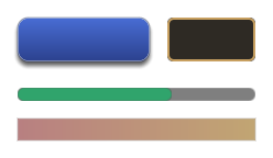
{ "component": "canvas_element", "kind": "Button", "text": "Start", "width": 160, "height": 44,
  "style": {
    "gradient": { "start": "#4A6FD8", "end": "#2A3F8A" },
    "cornerRadius": 10, "borderWidth": 1, "borderColor": "#FFFFFF40",
    "shadow": { "color": "#00000080", "offsetY": 3, "blur": 8 },
    "hovered": { "gradient": { "start": "#5A80EA", "end": "#34509C" } },
    "pressed": { "background": "#22346E", "textColor": "#C8D4FF" }
  } }
| Field | Type | What it does |
|---|---|---|
background |
colour | The fill, in place of the element's background. |
gradient |
{ start, end, horizontal } |
A gradient fill, top to bottom, or left to right when horizontal. It replaces the fill colour. |
image |
image | An Image's picture, a frame over the fill, or a Bar's track. |
fillImage |
image | A Bar's fill, cut at its value or squeezed into it, as fillImageMode says. |
fillImageMode |
Cut, Squeeze, Capped or Sweep |
How fillImage meets the value. Default Cut. |
cornerRadius |
number | Rounds the fill, gradient, border and shadow. A Bar's colour fill is rounded at both ends, a pill whose tip sits at its value. Images stay square. |
borderWidth, borderColor |
number, colour | A border inside the element's edge. It needs both. |
shadow |
{ color, offsetX, offsetY, blur, spread } |
A shadow behind the element, in its shape. Defaults: #00000080, 0, 2, 4, 0. |
textColor |
colour | The text of a Text or Button, in place of color. |
textShadow |
{ color, offsetX, offsetY, blur } |
A shadow under the text, hard unless blur softens its edge across that many dp either side; with no offset, a glow. Defaults: #000000C0, 1, 1, 0. |
textOutline |
{ color, width } |
An outline around every glyph, so text reads over any background, drawn with the glyph in one draw from the font's effect field, so a thick one stays round. Defaults: #000000, 1. |
alpha |
number, 0 to 1 | The element's opacity, its children included. |
hovered, pressed, disabled |
state | What changes while the pointer is over a Button, while it is held, and while it is disabled. |
transitionSeconds |
number | Seconds to interpolate between states, falling back to canvas_controls.theme.transitionSeconds; 0 or unset snaps at once. |
backdrop |
{ blur, tint, saturation, fallback } |
Frosted glass: what is drawn under the element this frame, the 3D scene included, blurred inside its cornerRadius shape, then tinted, under its own fill. blur is a radius in dp (default 16), saturation 1 keeps the colours. Where blur does not run, fallback fills the shape instead (unset: a colour from tint). See Glass windows. |
A state may set background, gradient, image, borderColor, textColor, shadow, scale and
alpha; anything it leaves out keeps the style's value. scale grows or shrinks what is painted
about the element's centre without moving its layout box or hit-test area. pressed applies over
hovered. A button drawn from a sheet of art changes its image region per state, and a state's
image can name a file of its own, which loadCanvasImages reads with the rest. A Joystick draws
only its colours.
Glass windows
A backdrop turns a translucent window into frosted glass, so the scene behind a HUD panel stays
readable without hiding it. The panel's own background is the tint over the glass; keep it
translucent.
{ "component": "canvas_element", "kind": "Panel", "anchor": "BottomLeft",
  "offsetX": 16, "offsetY": 16, "width": 400, "height": 300, "background": "#10141840",
  "style": {
    "cornerRadius": 12, "borderWidth": 1, "borderColor": "#FFFFFF30",
    "backdrop": { "blur": 16, "tint": "#FFFFFF14", "saturation": 1.2, "fallback": "#141820E0" }
  } }
What it costs is a few passes over the pixels the window covers, at half resolution or less, not
the whole frame. One 400 by 300 window at 1920 by 1080, blur 16, runs 5 blur passes and a
composite over a 532 by 432 region, about 268,000 texels written in all; at Low quality, 4 passes and
about 203,000. Windows that do not overlap share one blur; a window over another
runs its own, since its glass shows the window under it. A canvas with no backdrop costs nothing.
The glass is skipped, and fallback drawn with no extra pass, when the renderer's effect quality is
Off, when its surface cannot be sampled, or when the host turns it off for the canvas, for example
below the quality it wants glass at:
CompositionLocalProvider(LocalCanvasBackdropBlur provides (renderer.effectQuality >= EffectQuality.Medium)) {
    CanvasOverlay(items)
}
The glass follows the element's alpha and scale. A rotation turns the element's fill but not
its glass, and a control theme's slot styles draw no glass.
Draw images
An element's style holds its images. style.image is an Image's picture, the frame of a
Panel, Button or Text over its background, or a Bar's track. style.fillImage is a
Bar's fill, in place of color. Each names a PNG or JPEG in the project and says how it fills the
element. The image is cut into nine by four slice insets, in the image's pixels. The corners keep
their size, one dp per pixel, so a window frame stays crisp at any size. The edges stretch along
their length, and the centre stretches both ways.
[
  { "component": "canvas_element", "kind": "Panel", "width": 240, "height": 120,
    "style": { "image": { "path": "ui/window.png", "sliceLeft": 16, "sliceTop": 16, "sliceRight": 16,
                          "sliceBottom": 16, "repeatEdges": true, "pixelated": true } } },
  { "component": "canvas_element", "kind": "Bar", "width": 108, "height": 10, "value": 0.6,
    "style": { "fillImage": { "path": "ui/gauges.png", "regionY": 10, "regionHeight": 10,
                              "sliceLeft": 3, "sliceRight": 3 } } }
]
| Field | Type | Default | What it does |
|---|---|---|---|
path |
string | required | The image file, from the project's root. |
regionX, regionY |
integer | 0 |
The top-left pixel of the part of the image to use, such as one frame of a sheet. |
regionWidth, regionHeight |
integer | 0 |
The part's size. 0 reaches the image's right or bottom edge. |
sliceLeft, sliceTop, sliceRight, sliceBottom |
integer | 0 |
The corners' size in pixels. With none the whole image stretches. Slice only the left and right for a three-part strip, such as a gauge. |
repeatEdges |
boolean | false |
Tile the edges at their own size instead of stretching them, so a pattern keeps its spacing. |
repeatCenter |
boolean | false |
Tile the centre both ways instead of stretching it. |
tint |
#RRGGBB or #RRGGBBAA |
#FFFFFF |
Multiplies the image's colour and alpha. |
pixelated |
boolean | false |
Keep the pixels sharp when the image is scaled, for pixel art. |
pixelsPerDp |
number | 1 |
The image's pixels per dp. Art drawn at twice the size for high-density screens takes 2, so its corners and tiles stay the same size on screen. |
hollow |
boolean | false |
Leave the centre out, so a frame shows what is behind it. |
lazy |
boolean | false |
Read the image the first time an element drawing it shows, not when the scene opens. Until it has decoded, the element draws without it. |
A Bar's fill image is laid out at the bar's full width and cut at its value, so the fill's
pattern stays where it is as the value changes and its right end cap shows only at 100%. Set
style.fillImageMode to "Squeeze" to draw the fill at value times the bar's width instead: both
end caps stay and only the middle stretches, as many games' gauges do. Below the two caps' combined
width they shrink together rather than overlap. "Capped" keeps both caps whole at every value
above 0: the filled width is the two caps plus value of the rest, so a nearly empty bar still
shows its rounded ends. "Sweep" fills the bar's box clockwise from 12 o'clock, as a cooldown does.
Corners too big for the element shrink together. An
element whose image did not load, or whose region does not fit in it, draws without it.
When a project is played with awake:project:runtime, loadProject reads every image the scene's
canvas names, and the runtime draws them. If your app runs its own Compose host, pass the decoded
images yourself: SceneCanvas(world, images = loadCanvasImages(scene, files)).
An image only a window closed at entry draws, such as an item-icon atlas or a portrait sheet, need
not cost the first load: mark it "lazy": true. loadCanvasImages leaves out a path every element
names lazily, and the played project's runtime reads it the first time an element drawing it shows.
A host of its own gives the canvas AssetImages.asMap() from awake:compose:assets, seeded with
loadCanvasImages' result, for the same.
Images in Compose UI
A window drawn with Compose, rather than with canvas elements, asks for its art by path with
rememberAssetImage from awake:compose:assets. It is null until the image has loaded, then the
decoded image, so draw nothing, or a placeholder, until then:
context(_: Composer)
fun InventoryWindow() {
    val frame = rememberAssetImage("ui/window-frame.png")
    Box(Modifier.size(240.dp, 160.dp)) {
        if (frame != null) Image(frame, contentDescription = null, modifier = Modifier.fillMaxSize())
        // The window's contents.
    }
}
- No setup in a played project.
awake:project:runtimeprovides the project's files to the scene's UI asLocalAssetSource, and a per-scene image cache asLocalAssetImages. - Read once, off the frame. The first ask reads and decodes the file in the scene's coroutine scope; every later ask is a lookup that allocates nothing, on the desktop and the web alike.
- Shared with the canvas. The cache starts with the images the scene's canvas elements name, so a path both name is decoded once, and Compose draws the same image the canvas does.
- Freed on a scene switch. What the last scene's UI asked for is dropped when the next scene starts. A path the next scene asks for is read again.
- A missing path never throws. It stays null and is logged once.
LocalAssetImages.current
  ?.failure(path)
says why, for a window that shows a fallback.
An app that runs its own Compose host provides both itself, and owns their lifetime:
ProvideAssets(files, AssetImages(files, scope)) { ... }. Call reset(images) on the cache when its
scene changes, passing the canvas images it should start from.
Use a font
A Text, TextField or Button draws its words in Roboto unless its font names another. A value
ending in .ttf or .otf is a TrueType or OpenType file from the project's root. Any other value is
a built-in family: default is Roboto, and bitmap is a fixed-pitch pixel font.
{ "component": "canvas_element", "text": "Harbor Town", "fontSize": 32, "font": "fonts/title.ttf" }
loadProject loads each file once, while the scene loads, with the glyphs of UiFonts.DEFAULT_CHARS:
printable ASCII, the accented letters of Western and Central European text (Latin-1 Supplement and
Latin Extended-A) and signs such as € ™ “ ”; any other character draws as ?. A file that cannot be read, or is not a font
Awake reads, such as a collection or a WOFF file, is logged once, and its elements draw in the
default font. A host with no renderer reads no font. If your app runs its own Compose host, pass the
fonts yourself: SceneCanvas(world, fonts = loadCanvasFonts(scene, files)).
Text up to 24 pixels, after the canvas scaler and the display density, draws from glyphs rasterized
at exactly that size, so small labels stay sharp at a fractional scale too, where the size is rounded
to a whole pixel; larger text draws from a distance field. bitmap
keeps its pixel-art look at every size. See Draw crisp text.
Put elements inside others
An element whose node sits below another element's node in the scene is drawn inside that element.
Its anchor and offsets place it against the parent's box instead of the screen, and it draws over
the parent's own content. Move the parent and its children move with it; hide the parent and they
are hidden too. Plain nodes in between, such as a group, are passed through: the nearest element
above is the parent.
{ "name": "Status", "components": [ { "component": "canvas_element", "kind": "Panel",
    "offsetX": 8, "offsetY": 8, "width": 220, "height": 112,
    "style": { "image": { "path": "ui/status.png", "pixelated": true } } } ],
  "children": [
    { "name": "HP", "components": [ { "component": "canvas_element", "kind": "Bar",
        "offsetX": 96, "offsetY": 4, "width": 108, "height": 10, "value": 0.8, "color": "#E5484D" } ] }
  ] }
A child is laid out within its parent, so one that would stick out past the parent's edge is narrowed to fit.
Move a window
Mark a window's title bar moveHandle on its canvas_input, and dragging the bar moves the whole
window, the root element the bar sits in, by how far the pointer goes, with no ghost. It works with
the mouse and with one finger; a second finger is left alone. A press that never moves past the drag
threshold draggable uses stays a press, so a close button on the bar still clicks, and a
draggable slot inside the window still drags and drops.
val inventory = canvasPrefab(guid = "4c2d...", name = "Inventory") {
    size(320.dp, 240.dp)
    panel("Title Bar") {
        size(320.dp, 24.dp)
        moveHandle = true
        button("Close") { offset(296.dp, 0.dp); size(24.dp, 24.dp); action = "close-inventory" }
    }
    panel("Slot") { offset(16.dp, 40.dp); size(40.dp, 40.dp); draggable = true }
}
Only the window's own offsetX and offsetY change; what is inside keeps its layout. The window is
kept so its top, down to the bar's bottom, stays on the canvas, also after the canvas resizes; set
moveStrip to keep a different amount, in the window's dp. A window anchored to an edge stops at
that edge, so anchor a window that may go part way off the left at TopCenter or Center.
Pressing anywhere in such a window brings it to the front of the root elements of its order;
CanvasElement.bringToFront() does the same from code. When a move ends, the window's moved reads
its new offsets once, which is what to save; set offsetX and offsetY to put it back:
window.moved?.let { saved[windowId] = it }          // after the player lets go
saved[windowId]?.let { window.offsetX = it.x; window.offsetY = it.y } // when the window opens
Show game state
An element's bind reads the components of a node each frame, so a health bar or a score follows
the game without code. A field is component.field: the component's name in the scene document,
then its field, with dots for a field inside another. A game's own components bind the same way
once its capability registers them.
[
  { "component": "canvas_element", "kind": "Bar", "width": 120, "height": 12, "color": "#E5484D",
    "bind": { "node": "Player", "value": "health.current", "max": "health.max" } },
  { "component": "canvas_element", "text": "", "textAlign": "Center", "width": 120, "height": 12,
    "bind": { "node": "Player", "text": "HP {health.current}/{health.max}" } }
]
| Field | What it does |
|---|---|
node |
The name of the node whose components are read. |
value |
A Bar's or Sweep's fill: this field, divided by max. A Stepper's number: the field as it is. |
max |
A field, or a number such as "100". Left out, value is already a share from 0 to 1. |
text |
The words of a Text or Button, each {component.field} replaced by its value. A whole number shows exactly, however large, and any other number to one decimal place. A format after a colon, such as {purse.gold:n0}, sets how a number is written. |
textArgs |
A textKey's arguments read from fields: each name to its component.field, such as { "count": "inventory.count" }. See Show text in the player's language. |
cooldown |
An action button's cooldown left, a share from 0 (ready) to 1, or divided by cooldownMax, such as seconds left over seconds in all. See Action buttons. |
cooldownMax |
A field, or a number, cooldown is a share of. |
charges |
An action button's uses left, a whole number shown in a badge. |
enabled |
Whether an action button can be pressed: true or a number above 0. |
Gauges and steppers
A Bar is a progress bar. With no bar settings it fills across from the left, as it always has.
Its bar settings make it fill another way, trail a drop, split into blocks, or show its value:
[
  { "component": "canvas_element", "kind": "Bar", "width": 160, "height": 16, "color": "#30A46C",
    "fontSize": 12, "bind": { "node": "Player", "value": "health.current", "max": "health.max",
                              "text": "{health.current}/{health.max}" },
    "bar": { "track": "#FFFFFF20", "trailColor": "#E5484D", "label": true } },
  { "component": "canvas_element", "kind": "Bar", "width": 160, "height": 8, "color": "#F5D90A",
    "bind": { "node": "Player", "value": "stamina.current", "max": "stamina.max" },
    "bar": { "segments": 5 } }
]
bar field |
Default | What it does |
|---|---|---|
direction |
LeftToRight |
LeftToRight, RightToLeft, BottomToTop, TopToBottom, or Radial, around the element's centre clockwise from 12 o'clock. |
thickness |
0 |
A radial bar's ring width in dp; 0 fills a pie. |
track |
none | The colour of the part not yet filled, in the bar's shape. |
trailColor |
none | A second fill behind the first, in this colour. When the value drops it holds for trailDelay seconds (0.5), then drains at trailSpeed (1.5) of the bar a second; a rise moves it at once. |
segments, segmentGap |
0, 2 |
The bar as this many blocks, segmentGap dp apart, filled in turn. |
ticks, tickColor |
0, #00000080 |
Marks dividing the bar into this many equal parts. |
label |
false |
Shows the bar's text, textKey or bind.text centred on it, or else its value as a percentage, in white or the style's textColor. |
A fillImage still fills a bar that has settings, from the edge its direction names. With
style.fillImageMode Capped, its end caps stay whole at every value.
A Sweep fills its value of a full turn, for a cooldown, a timer or a charge. It draws in its
color, or its style.fillImage cut to the sweep, over its background. Its sweep settings say
how: startAngle in degrees clockwise from 12 o'clock (0), clockwise (true), a mask the pie
is cut to (Box, rounded by the style's cornerRadius, Circle, Pill or CutCorner), a ring
thickness in dp (0 for a pie), and a track colour for what is not yet swept. An action
button's cooldown draws the same sweep.
A Stepper holds a number between minus and plus buttons, such as a quantity to buy. Its stepper
settings give the value it starts at, min, max (0, 100), step (1), the decimals it
shows, and how a held button repeats: after repeatDelay seconds (0.4), every repeatInterval
(0.08). A click on it gives it the keyboard: Up and Down, or Left and Right, step it, Page Up and
Page Down take ten steps, and Home and End jump to min and max. Game code polls
consumeChange() and reads number, and calls stepBy(button) with a controller's button, so the
pad steps it too. A bound bind.value sets the number from a field every frame, so the game writes
the player's change back to the field.
Number formats
A format is a letter and a digit after a colon: the letter picks the style and the digit is the places after the decimal point.
| Text | Shows 1234567.891 as |
|---|---|
{purse.gold:n0} |
1,234,568, the digits in groups of three |
{purse.gold:n2} |
1,234,567.89 |
{purse.gold:f1} |
1234567.9, the digits alone |
{purse.share:p0} |
a fraction as a percentage: 0.456 shows as 46% |
A value rounds half away from zero, as it reads in decimal. A whole number keeps every digit, where
a Float would lose its last ones above 16,777,216. Digits group with , and the point is
., whatever the player's language; write the text yourself where that matters. A field that is not
a number shows as it is. A format that is not one of these, such as {purse.gold:int}, leaves its
placeholder as written, and scene validation reports it.
While a binding reads nothing, because no node has the name or its component has no such field, the
element shows its own value and text, and the log says so once. A Bar does the same for a value
that is not a finite number and for a max that is not above 0; a text shows such a value as it is,
NaN or Infinity.
Show text in the player's language
A Text or Button with a textKey shows that key's text from the project's string tables,
strings/<locale>.json, in the player's language, and changes when the game switches language,
with no reload. A played project loads its tables itself; Localization
has the tables, the locale switch and the message syntax.
[
  { "component": "canvas_element", "textKey": "hud.greeting", "textArgs": { "name": "Harbor Town" } },
  { "component": "canvas_element", "textKey": "hud.items", "offsetY": 60,
    "bind": { "node": "Player", "textArgs": { "count": "inventory.count" } } }
]
textArgs holds values the scene fixes. A value the game sets while it runs, such as a player's
name or a count, comes from a component field through bind's textArgs, read each frame, and
takes the place of a textArgs value of the same name; while the field reads nothing, the scene's
own value shows. A field's value goes in as it is, so {count, plural, one {# item} other {# items}}
reads a number field as a number, and a name holding { shows as typed. A system can also set the
live element's textKey and textArgs from code.
A key no table has shows as the key itself and is logged once. Set textKey or text, not both;
scene validation reports an element with both, a textKey on a kind with no words, and textArgs
with no textKey.
Lay out children
A parent with a layout places its children itself, as a CSS flexbox does: an action bar of slots,
a strip of buff icons that wraps, a party list. Each child keeps its width and height, ignores
its anchor and offsets, and runs in its order. Add or remove children at run time and the rest
move to make room.
{ "name": "ActionBar", "components": [ { "component": "canvas_element", "kind": "Panel",
    "anchor": "BottomCenter", "offsetY": 12, "width": 364, "height": 40,
    "layout": { "direction": "Row", "gap": 4, "padding": 4, "align": "Center" } } ],
  "children": [
    { "name": "Slot1", "components": [ { "component": "canvas_element", "kind": "Image", "order": 0,
        "width": 32, "height": 32, "style": { "image": { "path": "ui/slot.png", "pixelated": true } } } ] }
  ] }
| Field | Values | Default | What it does |
|---|---|---|---|
direction |
Row · RowReverse · Column · ColumnReverse |
Row |
The axis the children run along, and which way. |
wrap |
boolean | false |
Start a new line for children that do not fit. Wrapped lines stay packed at the start. |
gap |
number (dp) | 0 |
The space between children, and between lines. |
padding |
number (dp) | 0 |
The space between the parent's edge and its children. |
justify |
Start · Center · End · SpaceBetween · SpaceAround · SpaceEvenly |
Start |
How a line spreads its leftover space. |
align |
Start · Center · End · Stretch |
Start |
Where children sit across the line. A single line spans the whole parent. |
A child's grow gives it a share of its line's leftover space, so one slot can fill the rest of a
row. A child keeps its size even when the line is too short for it, so children that do not fit, or
padding wider than the parent, spill past its edge; nothing clips them. A child that follows a node
stands on its node instead of in the line. A parent without a layout anchors its children as
before.
Follow a node
An element with a follow stands where that node is drawn and moves with it: a name over a
character, a health bar over an enemy. Its anchor is the point of the element that sits on the
node's screen position, and offsetX and offsetY nudge it inward from there, as they do from a
screen edge; followOffset moves the point in the world first, such as two metres up to clear a
head. It hides while the node is behind the camera, and when no node has that name; when several
share it, the first is followed. Unlike at a screen edge, a negative offset moves the element outward
from the point.
{ "component": "canvas_element", "text": "Harbor Guard", "follow": "Guard",
  "followOffset": { "x": 0, "y": 2.2, "z": 0 }, "anchor": "BottomCenter", "offsetX": 0, "offsetY": 0,
  "width": 120, "height": 18, "textAlign": "Center",
  "style": { "textOutline": { "color": "#000000", "width": 1 } } }
With followBounds, the element instead covers the screen rectangle around the node's meshes and
everything under it, whatever its own size. Give it children anchored to its corners, and a marker
frames whatever is selected at any distance. followOutset grows the box on every side, so corner
pieces anchored at offset 0 sit that far outside the node. The box is the meshes' resting shape, so it does not
follow an animated character's limbs; a node with no mesh bounds falls back to its point.
A follower is placed against the screen wherever it sits in the scene, so it can live on a child of
the character it follows. The runtime projects through the camera it draws with; a host that draws
SceneCanvas itself passes the runtime's, canvasProjector(world), or a CanvasProjector of its
own, which reports points in the window's pixels. A canvas drawn over part of the window, such as an
editor's game view, still lands on what it follows.
Many followers
A scene with a name plate over every character needs to draw only the plates that matter. An element's
followRules says how its follower behaves in a crowd, and a canvas_follow_limit says how many of
a group are drawn at once. Each follower is projected once a frame, and one that is left out costs no
drawing.
- Culling. A follower whose box is wholly off the screen is left out (
cullOffScreen, on by default), as is one behind the camera, judged by its depth along the camera's view so it holds on every backend.maxDistancehides it farther than that from the camera, andocclusionhides it while something stands between the camera and its point; see Occlusion. - Priority and a cap. A
canvas_follow_limitwith amaxkeeps that many of itsgroup, byrankBy: the nearest, the highestfollowRules.priority, or the highestfollowScoregame code sets each frame. The rest are left out until they rank again. - Scale and fade.
scaleandfadeare curves by distance:pointsofatandvalue, straight between them. A plate can shrink to half its size at 50 metres and fade out by 80. - Edge pinning. With
pinToEdge, a follower whose target is off the screen or behind the camera holds to the screen's edge on the side the target lies,edgeMargindp in, and itspinnedandpinAnglesay so. A child withfollowArrowis drawn on the follower's edge toward the target, turned to point there.
[
  { "name": "Limits", "components": [ { "component": "canvas_follow_limit", "group": "quest", "max": 5, "rankBy": "Priority" } ] },
  { "name": "Marker", "components": [ { "component": "canvas_element", "kind": "Image", "follow": "Harbor Gate",
    "anchor": "Center", "offsetX": 0, "offsetY": 0, "width": 32, "height": 32,
    "followRules": { "group": "quest", "priority": 2, "pinToEdge": true, "edgeMargin": 24,
      "fade": { "points": [ { "at": 100, "value": 1 }, { "at": 300, "value": 0.4 } ] } } } ],
    "children": [ { "name": "Arrow", "components": [ { "component": "canvas_element", "kind": "Image",
      "followArrow": true, "width": 16, "height": 16 } ] } ] }
]
A game that shows and hides followers often, such as damage numbers, takes them from a
CanvasFollowerPool(world, template): acquire(target) { text = "-12" } hands out a hidden one
again, set back to the template, and release(entity) hides it for the next, so no entity is
created or destroyed while it plays.
Occlusion
A follower whose followRules.occlusion is true hides while a physics body stands between the
camera and the point it follows: a name plate behind a wall. A played project answers it with
physics rays, so the scene needs a physics world; the body of the node the follower follows, of a
node above it or under it, or its character's own body hides nothing; nor does a body the camera is
inside, such as a wall it was pushed into, which a ray cannot see past. Each followed node is cast
for at most once every few frames, and no more than a budget of rays a frame across all of them:
those that waited longest go first, and the rest keep their last answer. A follower is asked only
while it is on screen and near enough.
A canvas_follow_occlusion on any node sets the budget. Without one, a scene whose followers ask
casts with the defaults.
{ "name": "Occlusion", "components": [
  { "component": "canvas_follow_occlusion", "raysPerFrame": 16, "reuseFrames": 6, "layer": 0 }
] }
layer is the one collision layer the rays hit: 0, the static world's, keeps moving bodies, the
player's own capsule among them, from hiding anything. A host that runs its own systems adds
PhysicsCanvasOcclusion(physicsWorld, physicsSystem) after its physics step; one with another way
to tell, such as a depth read-back, sets its own CanvasOcclusion with world.setCanvasOcclusion.
Text in the world
Two kinds of text stand in a 3D world, and each has its own tool.
Name plates
A name plate over a character is a follower: a canvas element drawn on the screen
where the character is. Its followRules.scale curve sizes it by distance, and it stays as crisp as
text drawn at that size directly, by three rules:
- Laid out at its final size, never stretched. The curve's value is rounded to one of 16 sizes per doubling (neighbours about 4 % apart, with 0.5, 1 and 2 exact), and the plate is laid out again at that size, so its glyphs are whole-pixel sizes drawn the way all UI text is. A plate whose distance drifts holds its size until it is a quarter of a step past the next, so it does not flick between two sizes, and it is laid out again only when its size changes.
- On whole pixels while it moves slowly. While the point it follows moves less than a device pixel a frame, the plate's box snaps to whole device pixels, so a still or drifting camera draws the same pixels frame after frame. Faster than two pixels a frame it moves by the exact amount, where a whole-pixel step would judder.
- Faded without a layer. Its
followRules.fademultiplies what it draws, so nothing that reaches past its box, such as a descender or an outline, is cut. Where two of its own parts overlap, both fade, so the overlap shows through a little more than a layer would let it.
Planning where a hundred plates go, ranked under a canvas_follow_limit, allocates nothing per frame
once each plate has been drawn once.
Signs and labels in the scene
Text that belongs to the world rather than the screen, such as a sign on a wall, a label on a crate
or a number that should shrink with distance, is a world_text on a node. It is laid out once, drawn
in the scene pass from the font's distance field, hidden by what stands in front of it, and sorted
with other transparent things. Its edges are one screen pixel wide at any distance and angle: the
shader measures how fast the field changes across a pixel instead of assuming the text faces the
camera at a known size, so a sign seen up close stays sharp, and one seen far away or edge-on does
not sparkle or smear.
{ "name": "Harbor Sign", "transform": { "position": { "x": 0, "y": 2.5, "z": -4 } },
  "components": [ { "component": "world_text", "text": "Harbor Town", "size": 0.4, "weight": 700 } ] },
{ "name": "Crate Label", "transform": { "position": { "x": 2, "y": 1.2, "z": 0 } },
  "components": [ { "component": "world_text", "text": "Supplies", "size": 0.2, "billboard": true } ] }
From code, a WorldText from com.awakekt.awake:worldtext does the same without a scene:
WorldTextBatch(renderer).collect(text, worldMatrix, cameraLens, draws) adds its draws to a frame,
with the pipeline worldTextScenePipeline() in the backend's render plan (a played project's plan
already has it). Use a name plate for what must stay readable whatever the distance, and a
world_text for what should look like part of the place.
Show a 3D view
A View element shows what another camera sees, such as a character turning on a select screen.
camera names a node with a camera component; give that camera primary: false, or it could
become the main view. Each frame the element is drawn, that camera renders the scene into a picture
the size of the element's box in pixels, which fills the box, opaque, inside its
style.cornerRadius and under its children. The camera's own eye, center and fovYDegrees
frame it. It renders the whole scene, as the main view does, so place what it looks at where the
main camera does not see it.
[
  { "name": "Portrait Camera", "components": [ { "component": "camera", "primary": false,
    "eye": { "x": 100, "y": 1.5, "z": 3 }, "center": { "x": 100, "y": 1, "z": 0 }, "fovYDegrees": 40 } ] },
  { "name": "Portrait", "components": [ { "component": "canvas_element", "kind": "View", "camera": "Portrait Camera",
    "anchor": "CenterLeft", "width": 240, "height": 320, "style": { "cornerRadius": 8 } } ] }
]
With no node of that name, no camera on it, or no renderer, the element draws only its style. A
host that draws SceneCanvas itself passes the runtime's canvasViews(world) to show views: the
runtime renders each picture before the frame's UI and frees it once nothing draws it.
Scale the UI
SceneAppLifecycleRuntime.canvasScale, or SceneCanvas(world, scale = …), multiplies every
element's size, offset, text and image pixels. A HUD drawn from 1x pixel art reads at 2 on a large
screen. Every edge lands on a whole pixel at any scale, so the art stays crisp; at a fractional scale
such as 1.5, some of its pixels are a screen pixel wider than others.
Scale with the screen
A canvas_scaler on any node works the
scale out from the screen's size each frame, in place of canvasScale. With ScaleWithScreenSize
the HUD is designed at referenceWidth by referenceHeight and takes the same share of every
screen, following its width, its height or a blend of the two by match. ConstantPixelSize keeps
a unit pixelsPerUnit of the screen's pixels, for pixel art at any density, and
ConstantPhysicalSize keeps it 1 / referenceDpi of an inch, at the screen's real dots per inch
where the platform reports them: on Android and on a desktop monitor that reports its size. A
browser and iOS report none, so there a unit is a dp. DensityStep draws a unit as the largest
whole number of pixelsPerUnit-pixel steps that still leaves the screen's short side
referenceHeight units: on a 1080 pixel high screen against 720 that is one pixel per unit, on a
2160 one three, and a phone held either way gets the same scale. A touch HUD, read from closer,
usually sets referenceHeight to 360. minScale and maxScale hold the result, and
playerScale, which a settings menu sets, multiplies it after them.
A screen rarely gives a round scale: a 1017 dp tall window against the default 720 reference gives
1.4125. Text does not need one. Each text element's size is rounded to whole device pixels after the
scale and the density, so text up to 24 pixels draws from exact-size glyphs at any scale (13 at 1.4125
is an 18 pixel glyph, a 2% difference), and layout boxes keep the size the scale gives them. Pixel art
is what a fractional scale hurts: some of its pixels come out a screen pixel wider than others. snap
rounds the scale to the nearest whole number (WholeStep) or half (HalfStep) before the limits, so
the art is a clean multiple. The trade-off is layout size. The canvas is laid out at the rounded
scale, so every size and offset moves by up to half a step in proportion: HalfStep draws 1.4125 at
1.5, 6% larger, and WholeStep at 1, 29% smaller. Use snap for a pixel-art HUD, with HalfStep or
WholeStep as the layout can bear, and leave it None for a HUD of vector art and text.
{ "component": "canvas_scaler", "referenceWidth": 1920, "referenceHeight": 1080, "match": 1, "maxScale": 2 }
By default a canvas_scaler scales the whole canvas (scope: "Canvas"). Set scope to "Subtree" on
an element node, or on a plain grouping node above several elements, to scale only that node and what
sits under it while the rest of the canvas keeps its own scale — a HUD that grows with the screen
beside a 1:1 inspector window, or a pixel-art widget with snap: "WholeStep" inside a smoothly
scaled HUD. Layout, clipping and hit-testing in that subtree use its scaled coordinates, and an inner
Subtree scaler overrides an outer one for its own branch.
[
  { "name": "Hud", "components": [
      { "component": "canvas_scaler", "scope": "Subtree", "referenceWidth": 1280, "referenceHeight": 720, "match": 1, "snap": "HalfStep" },
      { "component": "canvas_rect", "width": 240, "height": 48 }
    ] },
  { "name": "Inspector", "components": [
      { "component": "canvas_rect", "anchor": "TopRight", "width": 320, "height": 220 }
    ] }
]
A host that draws CanvasOverlay itself passes the same rule as CanvasOverlay(items, scaler = …) or
on one CanvasItem(id, element, parent, scaler), and CanvasScaler.scaleFor(width, height, density)
answers it for any box.
Keep clear of a notch
The safe area is what covers the screen's edges, in dp: a notch or camera cutout, rounded corners,
a status bar or home indicator drawn over the game. Each platform reports its own: Android its system
bars and display cutout, iOS its view's safe area, and a browser its env(safe-area-inset-*), which
needs viewport-fit=cover in the page's viewport meta tag, as the templates have. A desktop window
has none. An element anchored on the canvas itself is placed inside it, its anchor and offsets
measured from the safe area's edges and centre. A backdrop that should reach under the notch sets
safeArea to false. An element inside another is placed in its parent's box, and a follower on
what it follows, either way.
A host that knows better sets SceneAppLifecycleRuntime.canvasSafeArea itself, or passes
SceneCanvas(world, safeArea = …): an editor previews a device by passing that device's insets.
canvasDpi likewise overrides the platform's dots per inch.
Android also reports AppFrame.systemGestureInsets: the edges where system navigation gestures
take priority, separate from safeArea. Both sets are relative to the engine surface and in dp,
including when the surface is embedded inside a larger window. A host receives updates after a
resize or inset change through WindowLifecycle.setSystemGestureInsets. Other hosts report
DisplayInsets.None unless they supply this information; their existing safe areas are unchanged.
When laying out edge controls, a host can choose the larger value on each edge from the visual and
gesture sets and pass that as its canvas safe area. Do not add the sets: they can overlap. General
panels can continue to use just the visual safe area.
Place something on a point
PointAnchor(x, y, pivot = Alignment.BottomCenter) is the same placement for any Compose UI: it
puts its content's pivot point on a point of its box, moved by offsetX and offsetY, for a
label or tooltip over a point the game works out itself.
Limit what is typed
Give a TextField a maxLength to stop typing, pasting and IME input there, as a chat line needs.
It counts the characters a player sees (maxLengthUnit: "Graphemes"), so a family emoji, a flag or
a thumbs-up with a skin tone is one character, and input is cut between characters, never inside
one. If your server limits a line by code points or by UTF-8 bytes, set maxLengthUnit to
CodePoints or Utf8Bytes with the server's number, so nothing the field accepts is refused or cut
when it arrives. A system writing text is not limited.
The caret, the arrow keys, Backspace, Delete and selection also step a whole character at a time. Emoji draw as the font's missing-glyph box until colour emoji fonts are supported, one box for each emoji.
Pad a field and hint at it
A TextField keeps its text 12 dp in from its edge, as shadcn's input does, so typed text never
starts on the border. Set padding to change it: { "horizontal": 8 }. The caret, a selection and
the scrolling of a long line all work inside the padding, and the field clips its text at its own
edge, so the tail of a leading j and the ring of an Å are not cut. Leave vertical at 0 unless
the field is taller than its line: the line is centred in the field, and vertical padding takes room
from it.
Give a field a placeholder, a key in the string tables, to show a hint while it is empty and does
not hold the keyboard. It draws in the field's text colour at half strength, and gives way to the
caret as soon as the field is focused.
Give any element a tooltip, also a key, to show a hint near the pointer once it has been over the
element for half a second. The hint stays inside the canvas, opening to the pointer's left or above
it at an edge, and goes when the pointer leaves the element or presses it. textArgs fill in the
placeholders of both keys.
{ "component": "canvas_element", "kind": "TextField", "width": 240, "height": 32,
  "placeholder": "chat.hint", "padding": { "horizontal": 10 }, "tooltip": "chat.tip" }
How it works
When a scene has any canvas_element, the scene runtime draws every visible element with
SceneCanvas(world) each frame. It does this even when the app declares no ui { }. The canvas is
drawn under the app's own ui { } content, so a pause menu covers the HUD.
The element's anchor places it against one of nine screen points. The offsets move it inward. On a
centred axis, the offset shifts it right or down, and a negative offset shifts it left or up, so an
element can sit either side of the centre. At an edge a negative offset is treated as zero, which
keeps the element against that edge rather than past it. The element's hit area is exactly its
width by height.
A TextField is a single-line field the player types into: a click focuses it, Enter submits and
frees it (consumeSubmit()), and Escape frees it without submitting. A system sets focused to
move the keyboard to or from it in code -- a chat window opening, say -- and reads it back for
whatever a click or a key already changed it to. The Enter a system reads to open the field this
way does not also submit it, even though the system and the field both see that same frame's Enter.
Give a TextField a one-character mask, such as "*", to make it a password field: it draws
the mask once for each typed character while text keeps what was typed, refuses copy and cut, and
reads as a password to accessibility services and the platform keyboard. Set mask back to "" to
show the password.
Projects played by runProject, or by the systems from sceneSystemsFor, also accept controls added
while playing. A HUD does not have to appear in the saved scene to get its input actions. Idle scenes
watch for controls without creating fallback input state; when controls arrive, action reading runs
before the canvas feeds its actions, and before movement and camera consumers.
A system using the standard gameplayInput() provider can read input.hostState for the host's
showTouchControls preference and lastInputDevice. The preference is the host's request before a
canvas's Auto visibility policy. lastInputDevice stays on a quiet frame; changeVersion increments
only when the device or preference changes, so a system can remember its last version and rebuild
its layout once per change. The state is updated before systems run and survives project scene
switches. A custom/headless provider can pass its own HostInputState to GameplayInput; the
two-argument constructor continues to report no host state.
A Joystick knob follows the thumb that landed on it up to the pad's edge and springs back on
release; another thumb on a button, or on the stick, never moves it. Its joystick settings make it
Floating, appearing where the thumb lands in its box, or Dynamic, dragged along past its reach,
and set its radius, a deadZone, a response or curve, four- or eight-way directions,
snapBack, a sprintThreshold past which it holds sprintAction, and an idle fade (idleAlpha,
idleDelay, fadeSeconds):
{ "component": "canvas_element", "kind": "Joystick", "anchor": "BottomLeft", "offsetX": 0, "offsetY": 0,
  "width": 360, "height": 300, "action": "move", "touchOnly": true,
  "background": "#FFFFFF30", "color": "#FFFFFFA0",
  "joystick": { "mode": "Floating", "radius": 64, "restX": 0.35, "restY": 0.6, "deadZone": 0.12,
                "sprintThreshold": 0.9, "sprintAction": "run", "idleAlpha": 0.4, "idleDelay": 2 } }
For a deterministic test or a host-supplied stick, element.setJoystickInput(x, y) accepts normalized
pad coordinates (right/down positive). It applies the widget's dead zone, response and sprint
threshold without synthesizing a pointer. Values are clamped to the pad's reach; (0, 0) centres
it even when snapBack is off. Non-finite input, a non-joystick element, or an actual pointer already
holding the joystick is rejected. Physical input can take over normally afterwards.
A touchOnly
element is drawn only when SceneCanvas(world, showTouchControls = true) is called, or when
SceneAppLifecycleRuntime.showTouchControls is true. When a project is played with
awake:project:runtime, an element whose action names one of the scene's
input actions adds to it: a move joystick steers the player,
a jump button jumps while held and a run button runs, as the keys do, and a button for an action of
your own holds and presses that action.
If your app runs its own Compose host, draw the canvas yourself:
val host = ComposeHost()
host.frame(FrameInput(viewportWidth = 800, viewportHeight = 600)) { SceneCanvas(world) }
A host that runs on SceneAppLifecycleRuntime but shows the game in part of its window, as an
editor's game view does, sets drawsSceneCanvas = false and draws the canvas over that part in its
ui { } content, with the runtime's projector and views so followers and Views draw. Here the game
view shows play, the world an editor plays the scene in, which the runtime's render system draws in
place of its own; leave the world out to use the runtime's own.
Box(Modifier.padding(start = 100.dp, top = 50.dp).size(400.dp, 300.dp)) {
    SceneCanvas(play, projector = runtime.canvasProjector(play), views = runtime.canvasViews(play))
}
One tap, one reader
consumePress() clears the tap it returns. If two systems poll the same button, only the first
one sees the tap. Poll it in one place and share the result, read isHeld, or count presses:
keep the count you saw last, and each tap since is one more, whoever else reads the button.
Bad colours do not break the frame
SceneValidator reports a colour that is not #RRGGBB or #RRGGBBAA, a negative size, a
fontSize that is not positive, a value outside 0 to 1, a font that is neither a .ttf or
.otf file nor a built-in family, and an image with no path, a negative region or slice, or
slices wider than their region. At draw time, a bad color falls
back to white and a bad background falls back to transparent.
Debugging
Each drawn element carries the test tag canvas-element-<entity id> in the UI's semantics tree.
SceneAppLifecycleRuntime.uiSemantics holds the last frame's tree, so a test can find an element
and check where it was placed.
Build a prefab in code
A plugin or a game that ships ready-made UI, such as a unit frame or an action bar, builds it as a
prefab of canvas_element nodes with canvasPrefab. Each element kind has its function (text,
panel, bar, button, textField, joystick, image, view, lookArea, sweep, stepper),
and each canvas_element field is a setting of the same name. Sizes and offsets are Dp, a font size
is Sp and colours are Colors; settings that are objects of their own, such as style, layout,
bind, bar, sweep or button, take their awake:ui:canvas type.
private val actionBar = canvasPrefab(guid = "c0ffee00-0000-4000-8000-000000000002", name = "Action Bar") {
    anchor = CanvasAnchor.BottomCenter
    size(320.dp, 64.dp)
    background = Color(0.1f, 0.1f, 0.1f, 0.75f)
    layout = CanvasLayout(direction = CanvasDirection.Row, gap = 4f, padding = 4f)
    button("Slot 1", id = "slot-1") {
        size(56.dp, 56.dp)
        action = "slot.1"
        textKey = "hud.slot.1"
        fontSize = 12.sp
        button = CanvasButton(cooldownSeconds = 1.5f)
        sweep("Cooldown", id = "slot-1-cooldown") { sweep = CanvasSweep(track = "#00000060") }
    }
    bar("Energy", id = "energy") {
        size(120.dp, 8.dp)
        bind = CanvasBinding(node = "Player", value = "energy.current", max = "energy.max")
        bar = CanvasBar(ticks = 4)
    }
}
canvasPrefab validates what it builds and throws a SceneValidationException listing each problem,
such as a field set on a kind it does nothing for, two nodes of one name, or two elements of one
elementId. CanvasPrefabs.problems(prefab) checks a prefab without throwing.
CanvasPrefabs.toJson(prefab) writes the file an editor saves: every field written and colours as
hex, #RRGGBB when opaque and #RRGGBBAA otherwise, as Color.toHex() writes them. Opened in the
editor and saved, it comes back unchanged, so keep the guid the same from one build to the next and
the file diffs cleanly. CanvasPrefabs.fromJson reads one back.
Find an element by id
Give each element code needs an elementId, the id of its function. Code finds it under one placed
copy's root, the entity its prefab_link node made, rather than by name: a name changes when someone
renames the node, and every copy of the prefab repeats it.
val leftSlot = assertNotNull(world.findCanvasElement(left, "slot-1"))
val rightSlot = assertNotNull(world.findCanvasElement(right, "slot-1"))
findCanvasElement looks at every canvas element in the world, so look up once, when the prefab is
placed, and keep the entity. A host that draws a prefab without a world finds the node in the prefab
itself with prefab.findCanvasNode("slot-1").
Bind elements with typed handles
Code that builds a prefab and then updates it, such as a widget a plugin ships, declares its
elements once as typed handles instead of repeating string ids in the builder and the binder. A
CanvasWidgetParts is the widget; each kind's function (text, image, bar, sweep, button
and the rest) declares a part of that kind, and list repeats a group of parts, such as a bar's
slots. The id of each part is composed from the declaration: icon in the fourth slot of bar is
bar.slot-3.icon. A function given no name declares the group's own element, whose id is the
group's.
/** One slot of [ActionBarParts]: the button itself, its icon, its cooldown and its count. */
internal class SlotParts(scope: CanvasPartScope) : CanvasParts(scope) {
    val button = button()
    val icon = image("icon")
    val cooldown = sweep("cooldown")
    val count = text("count")
}

/** A generic action bar: a frame, a title, an energy meter and [slotCount] slots. */
internal class ActionBarParts(slotCount: Int = SLOT_COUNT) : CanvasWidgetParts("bar") {
    val frame = panel()
    val title = text("title")
    val energy = bar("energy")
    val slots = list("slot", slotCount) { SlotParts(it) }
}
The prefab builder takes the handles where it takes a name and an id. Each element gets the part's
id and kind, and is named after its id unless you pass a name. The saved prefab holds plain string
ids, so an editor, a theme, a saved layout or an override sees the same file as before.
/** The action bar built from [ActionBarParts]' handles. */
internal fun actionBarFromParts(parts: ActionBarParts = ActionBarParts()): ScenePrefab =
    canvasPrefab(guid = BAR_GUID, name = "Action Bar", root = parts.frame) {
        layout = CanvasLayout(direction = CanvasDirection.Row, gap = 4f)
        text(parts.title, name = "Title") { textKey = "hud.bar.title" }
        bar(parts.energy, name = "Energy") { size(120.dp, 8.dp) }
        for (slot in parts.slots) {
            button(slot.button, name = "Slot ${slot.index}") {
                size(40.dp, 40.dp)
                button = CanvasButton(cooldownSeconds = 2f)
                image(slot.icon) { size(32.dp, 32.dp) }
                sweep(slot.cooldown) { sweep = CanvasSweep(track = "#00000060") }
                text(slot.count) { fontSize = 10.sp }
            }
        }
    }
To bind a placed copy, make one instance of the declaration for it and resolve it against the
copy's root. That walks the world once, binds every part, and throws a
CanvasPartResolutionException naming each part that is missing or of another kind, so a typo or a
part renamed on one side fails when the prefab is placed, not silently on every frame after it. Each
handle then exposes only its kind's fields, such as an image part's image or a bar's value, and
writes them on the cached element: no lookup and no string is built, so a binder can write every
frame. Read a list by index, for (i in slots.indices), in code that runs each frame.
val bar = ActionBarParts().resolve(world, root) // once, when the prefab is placed
// Then, each frame: typed fields on cached elements, no lookups.
bar.title.text = "Ready"
bar.title.textArgs = mapOf("count" to "3")
bar.energy.value = 0.25f
bar.slots[1].icon.image = icon
bar.slots[1].cooldown.value = 0.4f
bar.slots[1].count.text = "12"
bar.slots[1].button.charges = 2
bar.slots[2].button.enabled = false
bar.slots[2].icon.visible = false
Resolve again after a reload places a new copy. parts.slots.resolve(world, root) binds one list on
its own, and part.element reaches a field no typed handle exposes. findCanvasElement(root, id)
stays for tools and data-only lookups.
Migrate from string ids
Code that concatenated ids by hand built the same prefab:
/** The same action bar, as code wrote it before handles: every id and name concatenated by hand. */
internal fun actionBarFromStrings(): ScenePrefab =
    canvasPrefab(guid = BAR_GUID, name = "Action Bar", id = "bar") {
        layout = CanvasLayout(direction = CanvasDirection.Row, gap = 4f)
        text("Title", id = "bar.title") { textKey = "hud.bar.title" }
        bar("Energy", id = "bar.energy") { size(120.dp, 8.dp) }
        for (i in 0 until SLOT_COUNT) {
            button("Slot $i", id = "bar.slot-$i") {
                size(40.dp, 40.dp)
                button = CanvasButton(cooldownSeconds = 2f)
                image("bar.slot-$i.icon", id = "bar.slot-$i.icon") { size(32.dp, 32.dp) }
                sweep("bar.slot-$i.cooldown", id = "bar.slot-$i.cooldown") { sweep = CanvasSweep(track = "#00000060") }
                text("bar.slot-$i.count", id = "bar.slot-$i.count") { fontSize = 10.sp }
            }
        }
    }
Declare the parts so the derived ids are the ones the prefab already saves, and the file does not
change; CanvasPartsTest checks that these two builds are equal. Where an id was not built from the
structure, such as slot-1-cooldown, keep it with pinnedId, and use the item's index for a
repeated part:
class SlotParts(scope: CanvasPartScope) : CanvasParts(scope) {
    val cooldown = sweep("cooldown", pinnedId = "slot-${scope.index + 1}-cooldown")
}
Then replace each world.findCanvasElement(root, "...") and world.get<CanvasElement>(...) in the
binder with one resolve when the prefab is placed and the handles' fields after it, and delete the
names file the ids were kept in.
Save typed sizes and colours
A theme or a layout of your own can keep Dp, Sp and Color fields and still save as data:
DpSerializer and SpSerializer from awake:core:schema write a number, and ColorHexSerializer
writes the same hex a canvas element saves.
@Serializable
data class FrameTheme(
    @Serializable(with = DpSerializer::class) val gap: Dp = 4.dp,
    @Serializable(with = SpSerializer::class) val fontSize: Sp = 12.sp,
    @Serializable(with = ColorHexSerializer::class) val accent: Color = Color.White,
)
Declarative canvas content
A prefab plus typed handles is declarative only when it is built. After that, code keeps the canvas
in step with the game by hand, and the prefab's structure is fixed. canvasContent makes canvas
UI a function of state instead: if, forEach and key add, remove and reorder elements as the
state changes. The elements are still canvas entities, laid out, followed, bound and drawn by the
canvas as any other.
It runs on AwakeKt Compose's own runtime, so there is no second UI framework. key, remember and
CompositionLocals work as they do in Compose.
Declare a HUD from state
The reference sample is the showcase's Compose unit frame, ported to canvas elements. The state is plain data:
/** One party member, as the game's state holds it. */
internal data class PartyMember(val id: String, val name: String, val level: Int, val hp: Int, val maxHp: Int, val mp: Int, val maxMp: Int)

/** The party HUD's state: the members in the order they are shown. */
internal data class PartyState(val members: List<PartyMember>, val inCombat: Boolean = false)
A widget is a function with parameters, made of element functions: panel, text, image, bar,
button, and element(kind, …) for any other kind. Each one takes the same settings as
canvasPrefab's builder, CanvasElementScope, so there is one settings model. A leaf's block is
its settings, and a panel's settings go in settings = { … } while its block declares its children:
/** A unit frame: name and level over an HP bar and an MP bar, each with its numbers. */
context(_: Composer)
internal fun unitFrame(member: PartyMember) {
    panel(
        id = "frame-${member.id}",
        settings = {
            size(220.dp, 64.dp)
            background = Color(0.08f, 0.08f, 0.1f, 0.85f)
            layout = CanvasLayout(direction = CanvasDirection.Column, gap = 4f, padding = 8f)
        },
    ) {
        text(id = "name-${member.id}") {
            size(204.dp, 16.dp)
            text = "${member.name}  Lv.${member.level}"
            fontSize = 12.sp
        }
        gauge("hp-${member.id}", member.hp, member.maxHp, Color(0.8f, 0.15f, 0.15f, 1f), height = 14f)
        gauge("mp-${member.id}", member.mp, member.maxMp, Color(0.2f, 0.4f, 0.9f, 1f), height = 10f)
    }
}

/** A bar filled to [current] of [max], with the two numbers over it. */
context(_: Composer)
private fun gauge(id: String, current: Int, max: Int, fill: Color, height: Float) {
    val safeMax = max.coerceAtLeast(1)
    panel(id = id, settings = { size(204.dp, height.dp) }) {
        bar(id = "$id.fill") {
            size(204.dp, height.dp)
            offset(0.dp, 0.dp)
            value = (current.toFloat() / safeMax).coerceIn(0f, 1f)
            color = fill
            background = Color(0f, 0f, 0f, 0.5f)
        }
        text(id = "$id.label") {
            size(204.dp, height.dp)
            offset(0.dp, 0.dp)
            text = "$current / $safeMax"
            fontSize = 9.sp
            textAlign = CanvasAnchor.Center
        }
    }
}
canvasContent builds the HUD under a root entity, as a function of a StateFlow or a Store:
/** The party HUD: a frame per member, keyed so a frame keeps its entities as the party reorders. */
internal fun partyHud(world: World, hudRoot: Entity, party: StateFlow<PartyState>): CanvasContent =
    canvasContent(world, root = hudRoot, state = party) { state ->
        panel(
            id = "party",
            settings = {
                anchor = CanvasAnchor.TopLeft
                size(220.dp, 600.dp)
                layout = CanvasLayout(direction = CanvasDirection.Column, gap = 6f)
            },
        ) {
            state.members.forEach { member -> key(member.id) { unitFrame(member) } }
            if (state.inCombat) text(id = "combat") { textKey = "hud.combat" }
        }
    }
- When it runs.
CanvasContentSystem, one of the scene runtime's infrastructure systems, runs the block again on a frame where state its last pass read has changed, and on no other frame. A host that runs its own systems addsCanvasContentSystem()ahead ofTransformSystem. - What it follows. Reads are tracked: the
StateFloworStoreit was made from, anymutableStateOfthe block reads, and any flow it reads throughcollectAsState()(:awake:compose:state).canvasContent(world, root) { … }takes no state and follows only what the block reads. State it reads any other way, such as a plainvar, is not seen: callrecompose()on the returnedCanvasContentwhen that changes. - What it writes. A pass writes only the canvas components whose settings changed. Declaring what the last pass declared writes nothing.
- Keys. Wrap each item of a list in
key(item.id). A keyed item that moves keeps its entities and draws in its new place, and one that goes is destroyed with everything under it. - Order. Elements draw in the order the block declares them. Content declared under a node draws over what the scene already had there. The declared order is runtime state and is never saved.
- Disposing.
dispose()destroys what the block made and leaves its root.
Place a prefab
Prefabs stay the format an editor opens and saves. A block places one where its state says, and
binds the placed copy through its CanvasParts declaration:
key(member.id) {
    prefab(unitFramePrefab, parts = { UnitFrameParts() }) {
        name.text = member.name
        health.value = member.health
    }
}
The copy is made once per place or key and destroyed with it. Its parts are resolved once per copy,
and the block writes the overrides through them on each pass. prefab(unitFramePrefab) places a copy
with nothing to bind.
Compose inside an element
compose { } in an element's content draws ordinary Compose UI in that element's box:
canvasContent(world, root = hudRoot, state = partyState) { party ->
    panel(id = "party", settings = { size(240.dp, 120.dp) }) {
        compose { PartyFrames(party) }
    }
}
The canvas composes it where it draws the element: in the element's place in canvas order, under the elements inside it, with its alpha and its follow position. Compose layout applies inside the box only, and the canvas places the element itself. The pointer reaches the UI through the canvas's own hit testing, so an element drawn over it takes a tap first.
The block and the UI behave as one composition in practice:
- the block's state, and what it remembers, reach the UI as a closure;
- the CompositionLocals provided around compose { } are provided to the UI too, over the canvas's;
- a remember inside the UI lives as long as the element.
Control slots' slotContent map stays for prefabs authored in an editor. Code uses compose { }.
What it costs
The sample's tests (CanvasUnitFrameSampleTest) measure the party HUD on the applier's counters:
| Change | Entity writes | Entities made or destroyed |
|---|---|---|
| 60 frames with no new state | 0 | 0 |
| One member's HP | 2 (the bar's fill and its label) | 0 |
| 200 keyed frames reversed | 200 (each frame's sibling place, no component) | 0 |
Canvas content, a prefab, or Compose
- Canvas content: in-game UI whose structure follows game state, such as party frames, buff rows or a quest tracker. It is still canvas: it follows world entities, sorts with the scene and binds to components.
- A canvas prefab: UI an editor authors, themes or overrides, or a game changes without Kotlin. Canvas content can place it and bind it.
- AwakeKt Compose: menus, tools and screens around the game. Inside a canvas element, use
compose { }for a part a canvas element can't draw, such as a scrolling list or a text field with Compose behaviour.
Particles on a canvas
Attach canvas_particles (CanvasParticles in Kotlin) alongside canvas_rect to emit particles in
logical canvas dp units (+X right, +Y down; -90 degrees points upward on screen) on the same
ParticleSimulation that drives the 3D and 2D emitters. Leaving texture empty
("") draws solid-tinted quads; naming a project image loads and premultiplies it once through
loadCanvasImages, with optional columns × rows sprite-sheet cells.
Level-up burst on a bar
Set spawnRate to 0 on a progress bar's canvas_particles with shape = ElementEdge so particles
sit idle until gameplay calls emit(count) along the bar's perimeter:
{
  "name": "XpBar",
  "components": [
    { "component": "canvas_rect", "anchor": "BottomCenter", "offsetY": 24, "width": 280, "height": 18 },
    { "component": "canvas_bar", "value": 0.4 },
    {
      "component": "canvas_particles",
      "clipped": false,
      "additive": true,
      "texture": "assets/ui/spark.png",
      "maxParticles": 48,
      "spawnRate": 0,
      "lifetime": 0.45,
      "maxLifetime": 0.75,
      "size": 10,
      "endSize": 2,
      "tint": { "r": 1, "g": 0.85, "b": 0.3, "a": 1 },
      "endTint": { "r": 1, "g": 0.4, "b": 0.1, "a": 0.6 },
      "shape": { "kind": "ElementEdge" },
      "speed": 28,
      "maxSpeed": 64,
      "directionDegrees": -90,
      "spreadDegrees": 140
    }
  ]
}
val xpBar = world.canvasElements().getValue("XpBar")
if (didLevelUp) {
    xpBar.particles?.emit(24)
}
Button-press burst and CanvasBurstPool
Give a button an idle emitter (spawnRate = 0, placement = OverContent or BehindContent) and
fire emit(count) when consumePress() triggers:
val craftButton = world.canvasElements().getValue("CraftButton")
if (craftButton.consumePress()) {
    craftButton.particles?.emit(16)
}
For frequent one-shot bursts at arbitrary (xDp, yDp) canvas coordinates (pointer taps, coin
pickups, slot flashes) without adding or removing CanvasElements, keep a CanvasBurstPool and pass
its items into CanvasOverlay:
val tapBursts = CanvasBurstPool(maxSlots = 16, slotMaxParticles = 24)

// Built once, so firing it allocates nothing: a lambda written at the call, or a Color made inside
// it, would be a new object on every tap.
val sparkGold = Color(1f, 0.9f, 0.4f, 1f)
val tapSpark: (CanvasParticles) -> Unit = { emitter ->
    emitter.clipped = false
    emitter.additive = true
    emitter.lifetime = 0.35f
    emitter.size = 8f
    emitter.endSize = 2f
    emitter.speed = 40f
    emitter.maxSpeed = 90f
    emitter.tint = sparkGold
}

// Returns false and increments droppedBurstCount when all slots are live.
tapBursts.spawn(xDp = tapX, yDp = tapY, count = 12, configure = tapSpark)
Stepping, emit, spawn and the onParticleDeath (ParticleDeathListener) and dynamicSpawnRate
(ParticleSpawnRate) hooks allocate nothing per frame. Drawing still draws one texture with its own
tint per live particle each frame.
Clipping, layers, scaling, and visibility
- Clip escape (
clipped = false). By default (clipped = true), particles honour enclosing rectangle clips, path clips (Modifier.clip), and canvas masks. Settingclipped = falsewraps drawing inDrawScope.unclipped {}, escaping scissor/path clips and canvas masks within the active render target — including inside a faded ancestor (CanvasStyle(alpha = ...)), whose premultiplied fade the escaped particles still inherit without dark fringes.clipped = falsenever escapes an ancestor that renders into an offscreengraphicsLayer(CanvasStyle(rotation != 0f)orModifier.graphicsLayer): particles inside an offscreen layer remain bounded by that layer's target dimensions and by any clips enclosing the layer. - Stepping and hidden elements.
CanvasOverlaysteps every visible emitter once per frame usingLocalFrameClock(even when the element's rectangle sits off-screen or outside a clip), and pauses stepping while the element or an ancestor is hidden (visible == false, or a hiddentouchOnlycontrol). - Trailing (
localSpace = false) and UI scale. WithlocalSpace = true(default), live particles move with the element (including subpixel follower motion and subtreeCanvasScalers). WithlocalSpace = false, spawned particles detach into root canvasdpspace so moving the element leaves a trail behind; ifCanvasScalerorscalechanges mid-flight, detached in-flight particles scale uniformly with the root canvas.
See also
- UI with AwakeKt Compose for menus and tools written in Kotlin.
- Scene authoring for the scene DSL.
- Scene engine overview for loading scene documents.